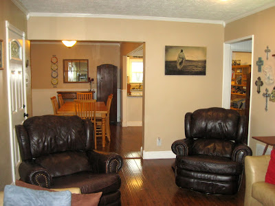
2616 County Road 33

2616 County Road 33

Saturday, February 1, 2014

PROPERTY OVERVIEW

SOLD ~ $205,000.  (April 2014)

General Information:
  • 4 Bedrooms
  • 2 Bathrooms
  • Built in 1940, updated 2010-2014
  • 2 Acre Lot Size
  • Ranch Style / One Story
  • 3 Car Garage with Carport
  • 10' x 8' Storage Shed
  • Property Type: Residential or Commercial Property (No Zoning)
  • City Water / Septic System
  • Electric Central A/C; Heat Pump / YORK Affinity 8T HVAC (installed May 2010)
  • SCHOOLS: All grade levels, London ISD
  • Low Property Taxes (outside city limits)    $2,463.13 (paid 10/28/13)  
Interior Features:
  • Bedroom # 1 is 13' x 13.5'
  • Bedroom #2 is 13.5' x 17.5'
  • Bedroom #3 is 10' x 12'
  • Bedroom #4 is 11' x 12.5' with separate 11' x 5' Walk-in Closet
  • 2 Handcrafted Stained Glass Transom Windows in each Bathroom
  • Flooring: Porcelain Tile (bathrooms), Wood Laminate (main areas), Carpet (bedrooms), Luxury Vinyl (laundry room)
  • Custom Porcelain Tile Showers
  • Granite Kitchen Countertops
  • Stainless Kitchen Appliances / Double Oven /Microwave / Refrigerator with Filtered Water and Icemaker
  • Dishwasher (with delay start option)
  • Laundry Room is 8.5' x 7'"
  • Living Room is 17' x 11'
  • Kitchen is 13' x 12'
  • Dining Area / Office Area is 19' x 13'
  • Original Starburst Textured Ceiling throughout much of the house.
  • Updated Electrical and Plumbing
  • All Exterior Walls Newly Insulated with R13 Fiberglas Insulation
  • Lot's of Storage Throughout
Exterior Features:
  • Covered Front Porch 7' x 24'
  • Back Yard Covered Patio 9.5' x 18' (off Bedroom #2)
  • HardiePlank Fiber Cement Siding
  • Energy Efficient Vinyl Double Paned Windows (installed 2010)
  • Asphalt Shingle Roof
  • Pier and Beam Foundation
  • Fenced Back Yard and Parking Area
  • Mature Shade Trees

Tuesday, January 28, 2014

Laundry Room

It's said that a nice (updated) kitchen and bathrooms in a house are often times a "make it or break it" for selling that house.  For me, the laundry room is also a "make it or break it".  A functional and updated laundry room that has some elbow space is a must. 
 
As a family, we do 1-3 loads of laundry a day, so to finally get this room renovated and updated is a huge treat!  Our Laundry Room update started in mid- October 2013 and was finished December 2013.  This space is the last room for us to renovate in the interior of the 12 different spaces we gutted and updated in our 1940 fixer upper starting in February 2010.  This Laundry room is approximately 8.5' x 7'.

BEFORE~

Picture taken before appliances were moved in... it was a dark room with no windows (natural light).  The dated wood paneling was worn and dirty.  The exterior door was a solid steel door (no windows).   The floor was covered with dated, cracked linoleum (appearing to be from the 1960-70's).

 The wall area where the washer and dryer hooked up was done in a very "make-shift" way using exterior faucet fixtures mounted on a scrap piece of plywood with no indication of which was the hot water and which was the cold water.  There was old crusty white caulk holding the fixtures in place.  The black PVC pipe was set up for the washer drainage; old caulk on top and steel wool surrounded the bottom of the pipe to keep critters from coming in our house.

I forgot to take a before picture of the hot water closet and remembered after we demo'ed the wall and updated the plumbing.  In the above photo, you can see the "before" of how the hot water heater closet was dark wood and installed with empty space underneath.  Over the past several years as we used this room, my washing machine fit against the wall under the hot water heater cabinet. 
 
This room was one of few that actually had some insulation in it.  We disposed of the old insulation and replaced it with new R13 wall insulation (not shown in this photo).
 
When we moved to this house we bought a new Electrolux washer and dryer set.  It was a nice blessing to have them, but strange to have new model appliances in an old outdated space.  After nearly 4 years functioning in this gloomy laundry room, we are now completely transformed!
 
AFTER~
New dry wall areas are painted a light grey satin while the new beadboard wall panels are painted a crisp ultra white.  Two new pot (can) lights where installed in the ceiling.  As you can see, the exterior door was replaced from the original with a half French door allowing much need natural light into the space.  Since the floor was tiled with old linoleum that most likely contained asbestos, we poured leveling cement over the old floor to ensure a nice flat, level surface to install the new groutable (Armstrong - Tough Guard) luxury vinyl tiles.  We used 1/8" spacers between each tile and grey grout fills the spaces to finish this Laundry Room floor.  To my surprise, the vinyl tile floor looks just as great as the porcelain floors we have in the two bathrooms!
Yay! new and updated washing washing connections...
we now know which is hot water and which is cold water!
 
We left the hot water heater alone and simply refaced and repainted the existing cabinet.  A bottom unit was built to accommodate storage for a bin of dog food and our kitty-cat's litter box.
 
Extras we added... a "cubby" just inside the door to hang coats, hats, and misc.  The bench is a great place to kick off muddy shoes/boots that can be stored underneath.
The weathered wood is recycled from discarded fencing.
The three coat hangers and two matching knobs are from Hobby Lobby.  I love Hobby Lobby!!!
 
The hand crafted glass transom window was installed during our Bathroom #2 renovation.  Since the bathroom was originally so dark, we knew we would be changing out the Laundry Room exterior door to include a window to let in natural light.  Besides letting additional light into the bathroom, this transom adds a nice specialty detail to both rooms (Laundry Room and Bathroom).
 
I now enjoy spending time in
my new Laundry Room!

Sunday, January 12, 2014

Dining and Office Area


 DINING ROOM BEFORE
Before furniture is moved in.
DINING ROOM AFTER


 before...
...living in chaos as we renovate.
Rooms complete; now much better.

DINING ROOM IN PROGRESS
 Taking the wood paneling off...
Under the wood panel was 1/4 " dry wall, and under the dry wall, wall paper...

...vintage wall paper!

 Under the wall paper, thick lap siding wall board.
 We took off every other board (numbered them) so that we could update the electrical and add wall insulation; none of these walls were originally insulated.
Wall insulation in and boards getting ready to be put back.
  
OFFICE AREA BEFORE
This area is open to the dining area.
 
...AFTER


OFFICE AREA BEFORE

  ...AFTER

Friday, October 4, 2013

Front Exterior and Curb Appeal

The original curb appeal of this home was drab and dated.  The siding was a worn out light blue grey vinyl siding, a very small front porch (that had issues), and badly cracked front sidewalk, with overgrown landscape on one side with no landscape on the other side. 

To update this home and add curb appeal, we chose to re-side with James Hardie Siding (purchased through Lowes and Home Depot).  Hardie Siding is a Fiber Cement siding that has many benefits:  Flame resistant, weather resistant, termite and pest resistant, and fade resistant.  A full sized front porch replaces the small one, a new sidewalk replaces the old, and xeriscape plantings surround the foundation with river rock mulch.

BEFORE~
 
 AFTER~
 
 
BEFORE~
This photo taken the day after we moved in prior to all new windows.  Original windows were single pane with areas where water leaked through due to inadequate caulking.  Notice the overgrown shrubs against the house... they were hiding a broken window.

The original porch was small (4 x 6) with issues of wood rot and sagging.
(New energy efficient windows are shown in this photo)

AFTER~
 
New porch area (7 x 24)

BEFORE~
The original wood door is unique and weathered, but NOT energy efficient or practical.  In the summer, massive heat could be felt coming through the cracks, and in the winter, a cold draft could be felt.

AFTER~
A new energy efficient door with leaded glass insert.
 
 BEFORE~
The original sidewalk had several dangerous cracks.

AFTER~
 
BEFORE~

One of several cracks; a major trip hazard.
 
The solution to a dangerous sidewalk is to tear it out, and build it over in a safe manner.  When we tore the original sidewalk out, we discovered there were places that were only 1 1/2" - 2" thick; these are the places that cracked.  We reconstructed a new sidewalk that is 4" - 6" thick.  We also constructed the new sidewalk to wrap around to the side area connecting to the garage concrete  (not pictured here) which was just dirt walkway before.


AFTER~
 New sidewalk with simple xeriscape foundation plantings.


Master Walk-in Closet

This closet is located just out side bedroom #4 (what we use as the Master Bedroom). With only one long 10 foot bar on one side and shelves along both walls, this closet space was not functioning to it's fullest potential when we moved in the house.  The money spent ($761) to organize this 11' x 5' closet space was well worth it (transformation completed December 2011).

BEFORE
This photo taken prior to moving our belongings in (brown door is an example of all the doors throughout the house when we purchased it)
Now that our things are moved into this space, it's utter chaos.
We have too many clothes for them all to be hung on one single bar and too many shoes to cover the floor.
Before renovated, it was hard to keep organized with no place to put our stuff; not to mention over half of it was still in boxes (in storage).  I (Teri) sat on the floor to put my make up on and fix my hair each morning.


AFTER 
Mission accomplished! 
Function and practicality with floor to ceiling storage.
 
Kirk has half the closet, I have the other half...
well maybe I have a little more than half.

I purposefully cut a niche in the wall to utilize space; this shelf accommodates vitamins, cologne, and some hair product.

This shelf unit WAS the kitchen peninsula.  It has been retrofit smaller to be in this space... it has been resurfaced with a porcelain tile top (to match the bathroom tile), resided, and repainted.  This "re-purposed" piece makes the perfect makeup counter and storage so the bathroom can be free for people to take showers and use the toilet while us girls get dressed and primp.
 
This stool stays in this location as a means to reach the high places; it also serves as a great landing station to stack clean laundry while it gets put away.


Friday, April 26, 2013

Hallways

There are two separate hall areas in this home, both updated to add a brighter feel and one hall area a closet added for much needed organization.

HALL #1 (opening to Bedrooms #1, 2, &3 and bathroom #2)  This hall has two closets; one as a storage/linen closet, and the other is a mechanical closet housing the air conditioner unit. The air conditioner unit closet has the old original door that has been repainted white and the only original antique door knob in the whole house.

BEFORE

All dark wood panel.  This "before photo" does not show the two white doors original state of solid brown matching the panel.  Our original thought was to simply paint the brown panel white...
...we decided after we got started painting the primer coat that it wasn't going to look very good as painted panel, so we bought bead board that replaced the brown panel.  This hall was originally carpeted with a very worn contractor grade beige.
  AFTER
Bright white and fresh.  The hall ceiling light is the original.


The only original door knob from this house- on the A/C closet door
 HALL #2 (opening to Bedroom #4, bathroom #1, and walk in closet)

BEFORE

This brown door was an awkward entrance to Bedroom #3.  We chose to eliminate this door and add a closet to this hall area space.
 AFTER

New closet.